Exploring the Feeling Responsive Template
Here, we explore one of the most flexible and user friendly template that I’ve found for the Jekyll Site. We’ll quickly go through my motivations for exploring this template, and then circle to the exciting features that the template provides!
Kallang Dog Community
Shortly after shifting into the Kallang region, and also welcoming our doggo Stormy with open arms – we prompty stumbled into a welcoming dog community!
This is a tight knit community, gathering daily at 2130 hours SGT to catch up and ensure that that their dogs receive sufficient social interactions. During these catch up sessions, knowledge such as reliable vets, commons issues faced by other dog owners are discussed. This creates a collective knowledge of dog owners, that maximizes the chances of an owner and his furry pal living in harmony!
My Contribution
Now we come to my contribution to this community - it’s not much! I’m not the most active member of the community but I do join them every Tuesday and Thursdays (as long as life does not get in the way). Leech off some tips from other veteran dog owners, to see how we can improve the relationship between stormo and myself ^^.
Recently, they’ve shared a list of members in their community - paws of 2024! I personally thought this was an interesting idea. Since I’m on a journey to explore different tools that will deepen my understanding of both technology and dog behaviour, seems apt to explore the feasibility of building a simple site for the Kallang Dog Community People.
Feeling Responsive Tempalte
So I went ahead and researched for a template, and found an amazing template called Feeling Responsive. This template is extremely user friendly, and has been designed so that you can easily modify the template to suit your needs, whatever it is:
- A portfolio
- A blog
- A professional website
If you’re interested, you can view the demo of the template here!.
The source code of the template can be forked from here!
Planned Site Structure (Raw notes)
After exploring the template, I have noted down the main features of the template that I plan to use. Ideally, this would be used to create the Kallang Dog Community website. But even if that plan did not manifest, would still have gained some insights by fiddling around and familiarizing with the Feeling Responsive template. Given how powerful this template is, it’s definitely going to come in handy sometime in the future.
For those whom are interested, this is the plan: 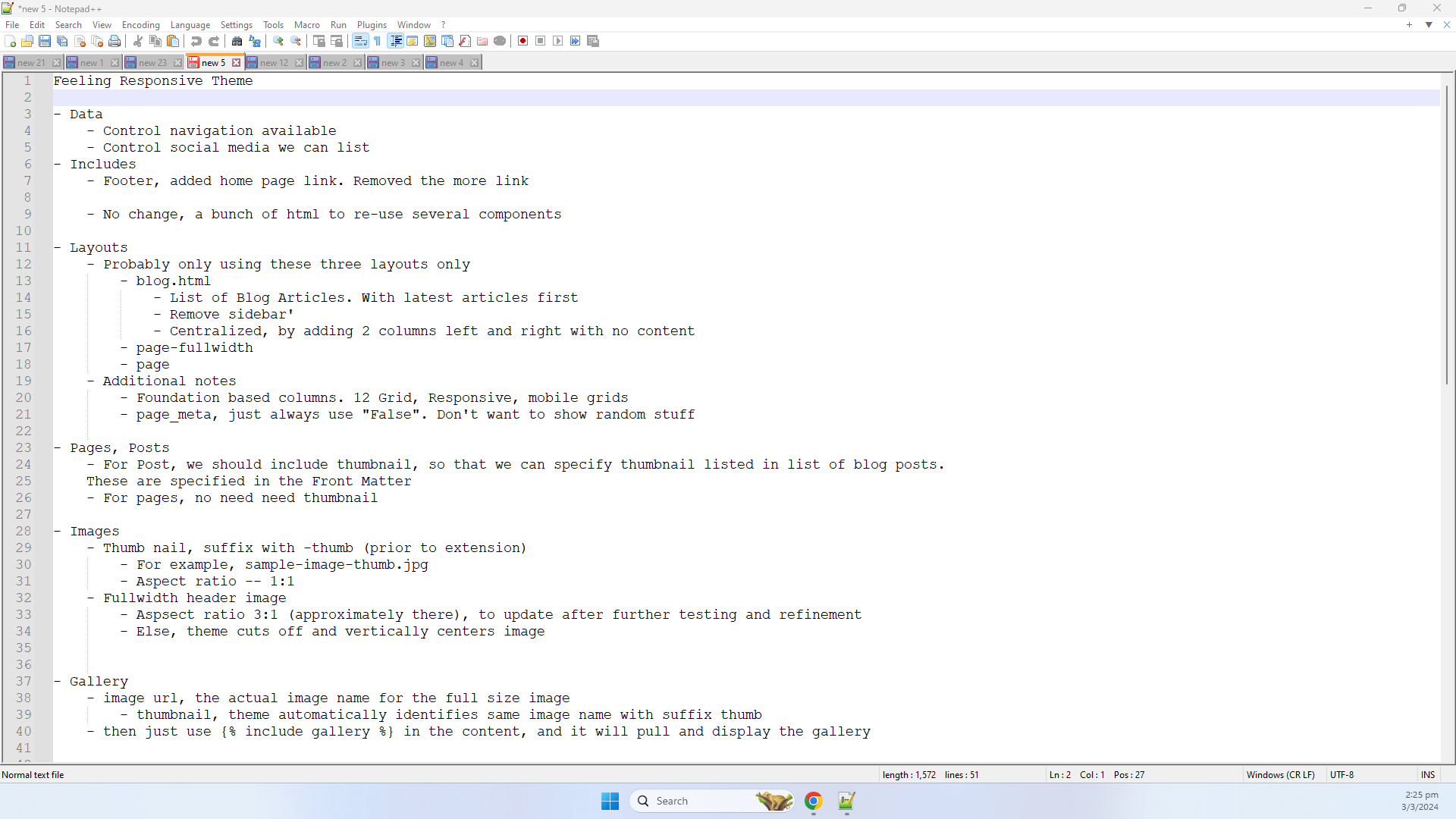
The next few sections, will aim to organize my notes into a more readable structure – that way, I can show off what I’ve learnt ^^ But more importantly, I’d have a reference on how we can utilize the Feeling Responsive features for any future sites that I’m planning to create!
This artile will only list down the features that I’ve personally explord and plan to use – doesn’t cover the full suite of functionalities provided by this template. For a comprehensive view of what the Feeling Responsive template is capable of, please visit their official documentation.
Navigation Menu Configuration
The first thing that jumped up at me was the ease of managing the navigation menu bar: 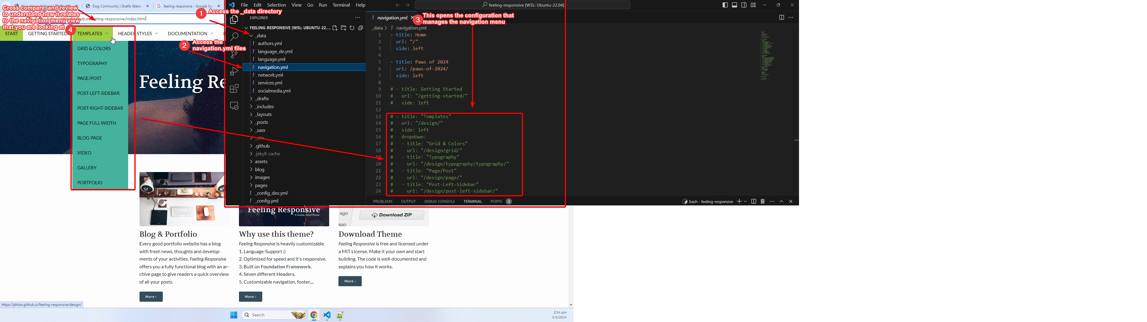
- Access the
_datadirectory - Find the
navigation.ymlfile - Open the
navigation.ymlfile and cross check the configuration against theFeeling Responsivetemplate, to get an understanding of how it works
I’ve hosted the version I modified so that everyone can see the end product of modifying the Feeling Responsive template.
The breakdown of how navigation is configured is as follows:
- Each main menu label, will have it’s own YAML block (a collection of key-value pairs).
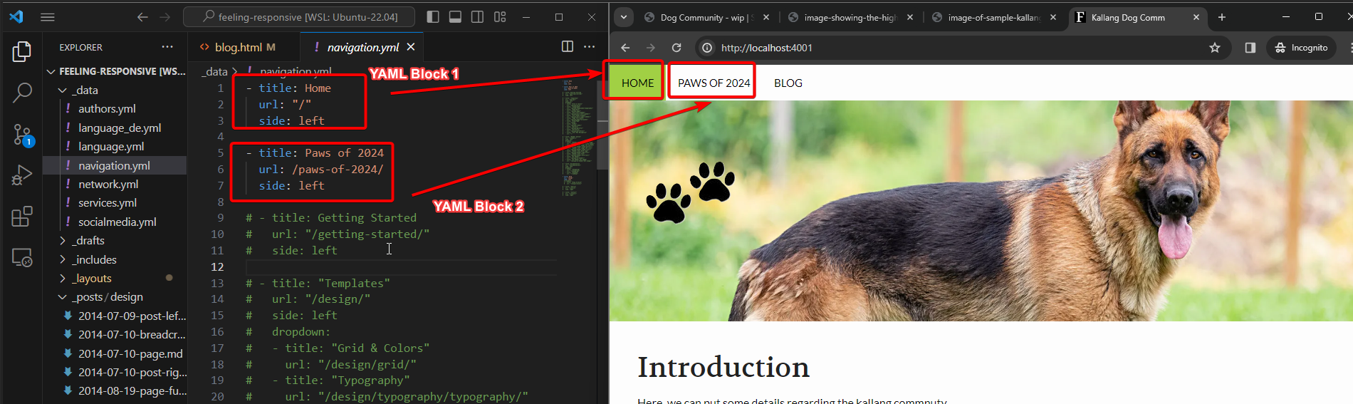
- The label of the navigation menu is configured in the
titleproperty.
In the example above, we have indicatedPaws of 2024as the label for one of the main navigation menus.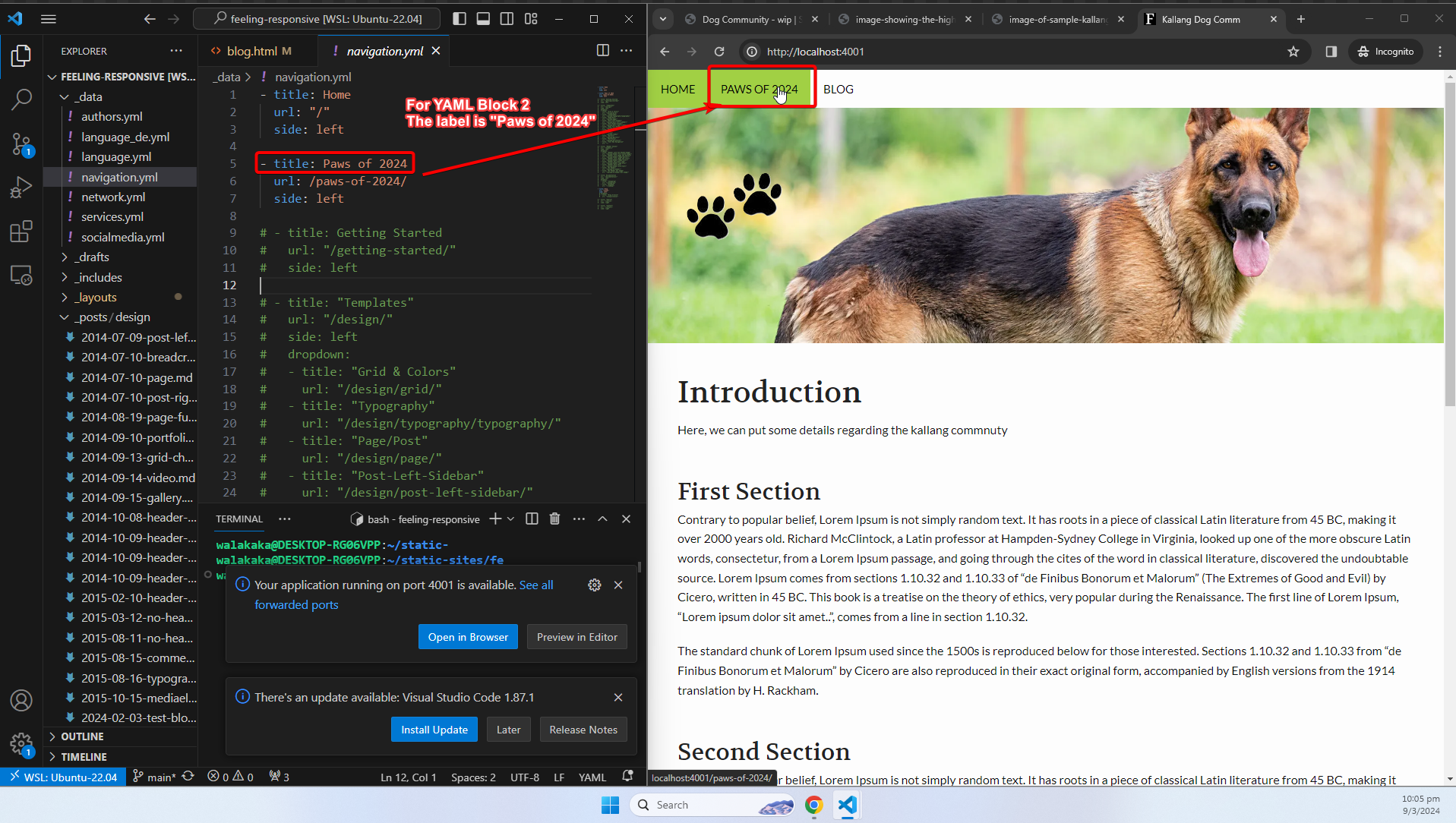
- The path of the site would be configured in the
urlproperty.
In the example above, we have indicated/paws-of-2024as the path that users will be directed to when clicking thePaws of 2024navigation menu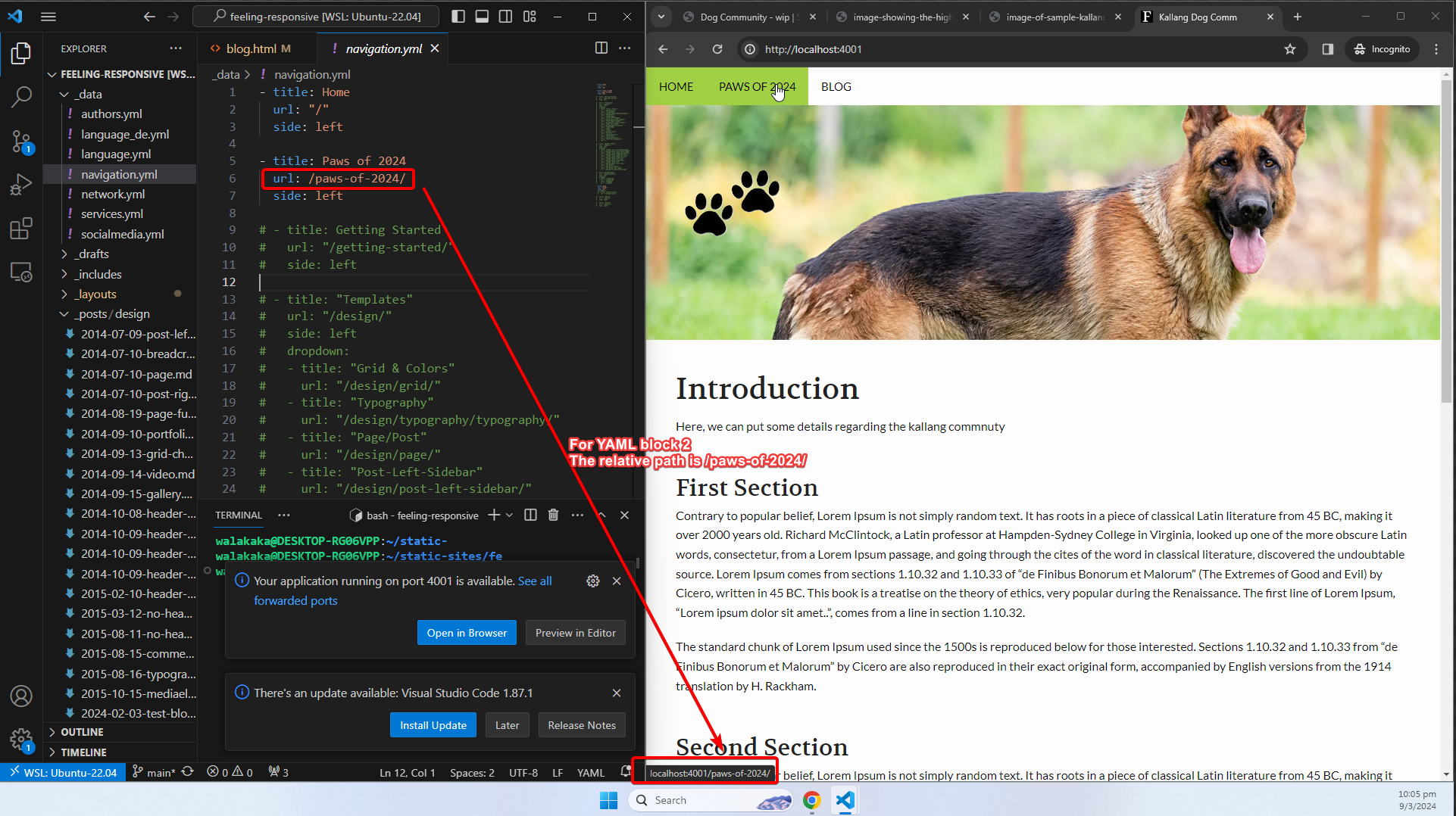
- The location of the menu (e.g., left or right), will be configured in the
sideproperty.
In the example above, the menus are located on the left hand side of the screen.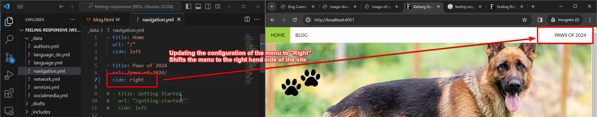
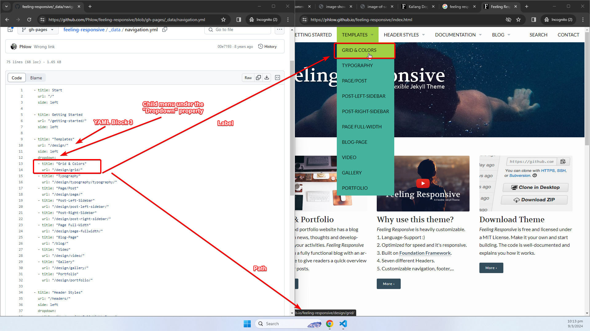
- If there are child menus, these will be configured in the
dropdownproperty of the same YAML block.
Layouts (Page, Page-Fullwidth)
Now, we move onto the layouts that I’m planning on using. There are three main layouts I’ve planned to use:
- Page
- Page-Fullwidth
- Blog
The Page and Page-Fullwidth layouts come in ready out of the box, for you to use. There is no intention or need to make any modifications to these layouts for the site that we’re planning for.
To use the layouts, simply specify the layout in your Jekyll Front Matter, using the layout property.
- Specifying
pagewill load the page template: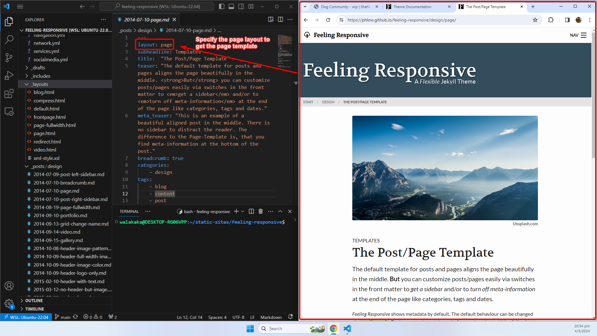
- Specifying the
page-fullwidthvalue will load the fullwidth page template! It’s that easy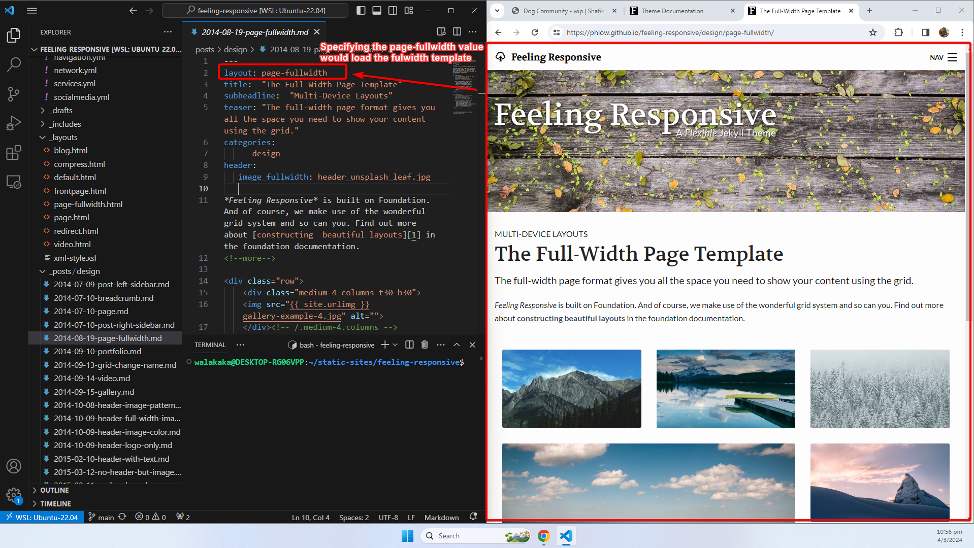
Layouts (Blog)
We will be making some modifications to the blog template to make sure the blog list page suits our style. The fact that we can modify the layout is a testatement to how user friendly the Feeling Responsive template is:
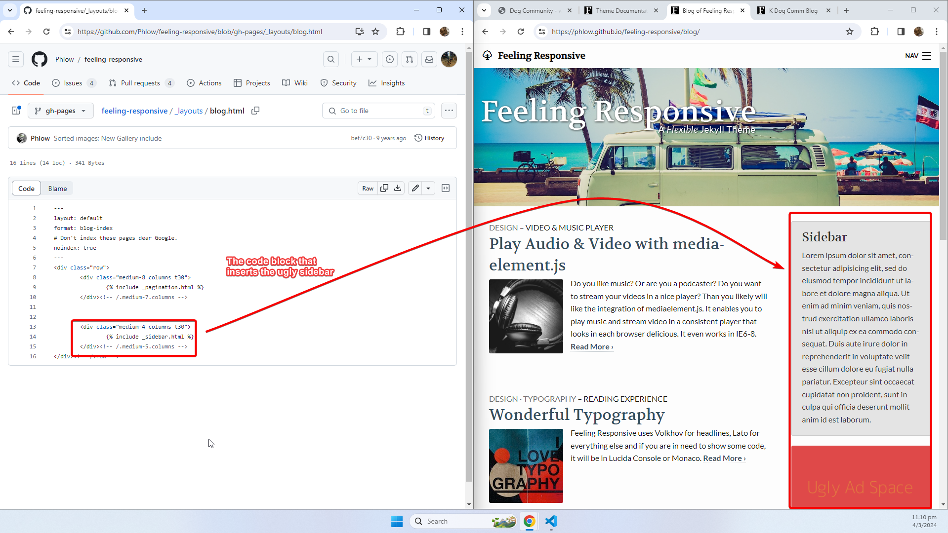
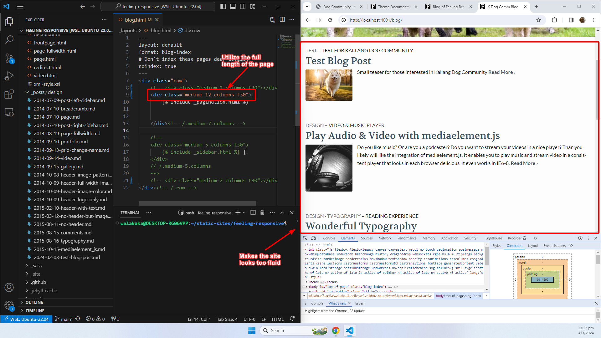
- The blog template, comes with sidebar that we don’t really like. See the screenshot below for the original version of the page (with sidebar)
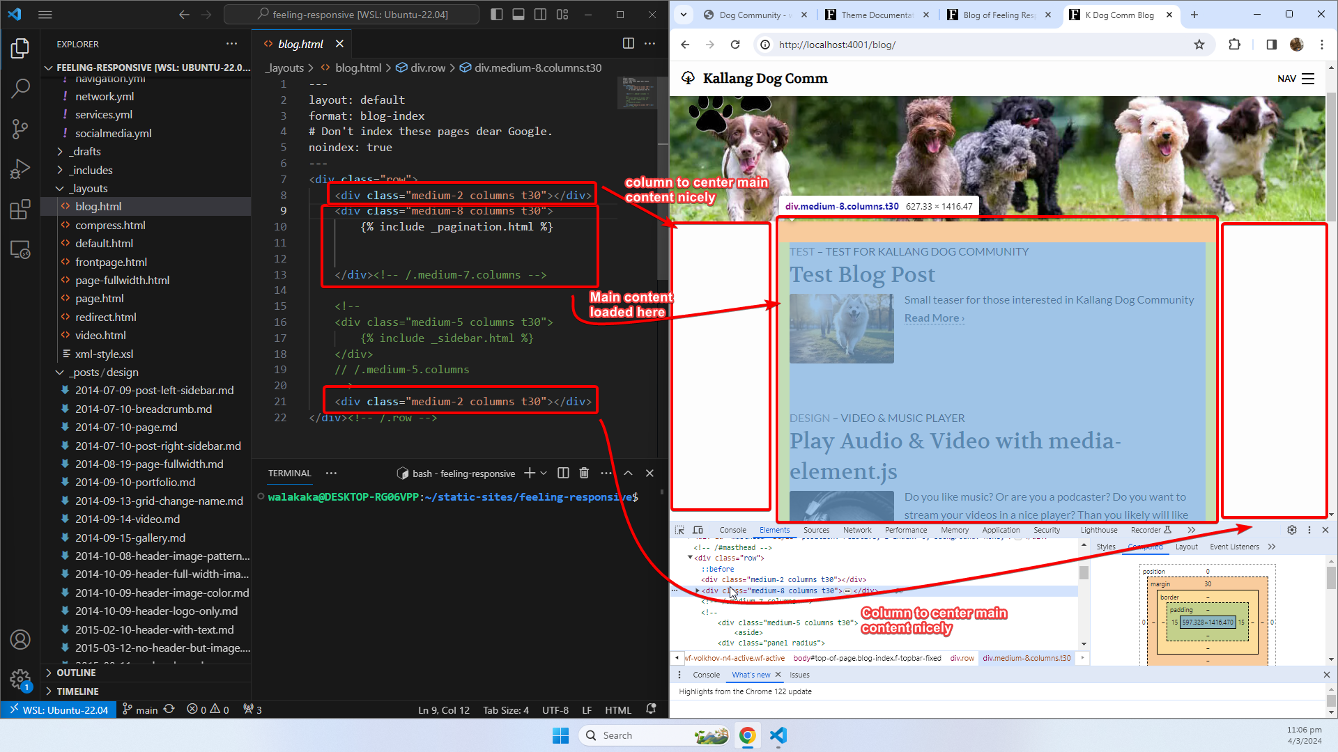
- As you can see in our source code above, we have modified and commented out the sider element. On top of that, we have also added 2 columns to each side of the main content to ensure that it’s nicely centered in the webpage
Layouts (Blog), Design Decisions
The reason why we have those 2 additional columns was because:
- Utilizing the fullwidth of the page makes the site looks too fluid:
- Leaving out the spacer columns will leave an awkward gap on the right hand-side. The gap was previously filled by the sidebar that we have recently removed:
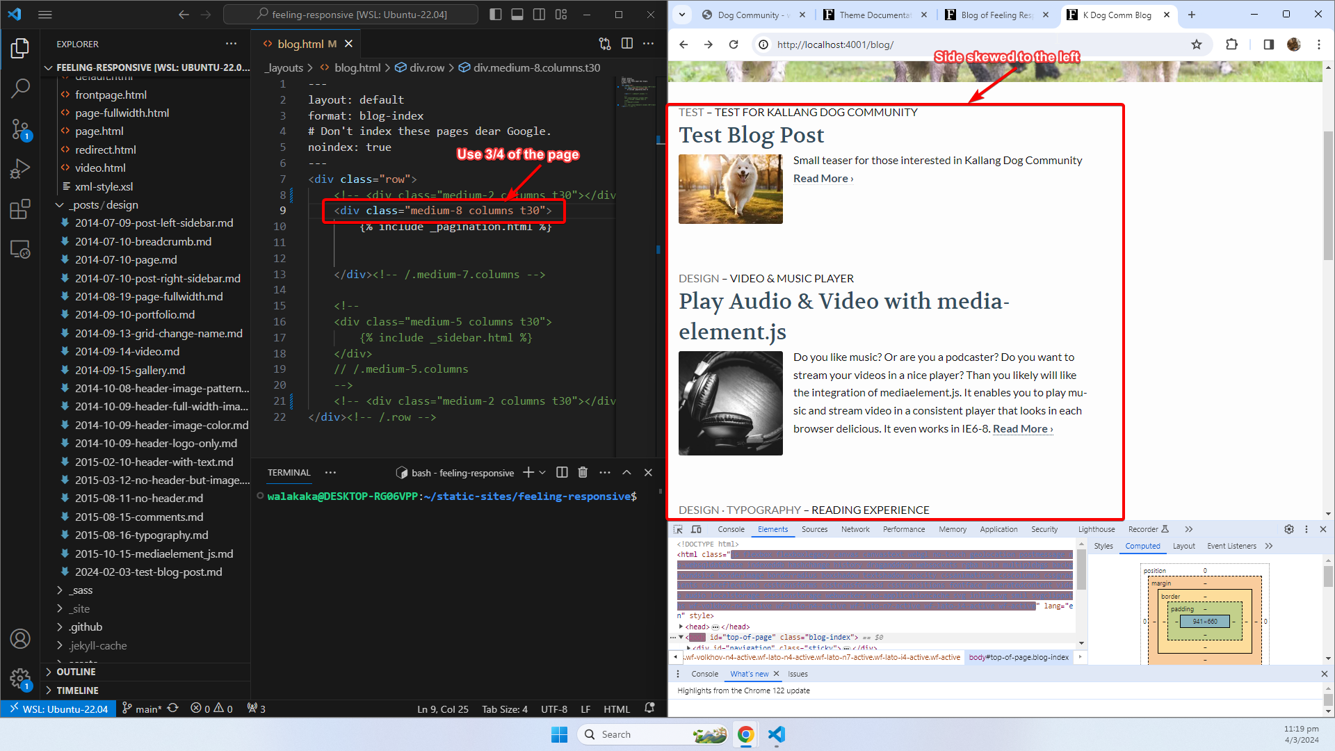
Hence, why we’ll be removing the sidebar, and adding two spacer columns for the blog template!
Includes
The last template modification that we would be making would be done in the _includes folder. This folder normally contains files that contains the html content that are referenced by layouts to generate template. The contents in the includes folder are referenced by multiple layouts. With this structure, we only have to make a change in one location before the changes are reflected across all the templates that references it. Let’s take the generation of the Footer in the Home page for example:
- The
Homepage is using thepage-fullwidthlayout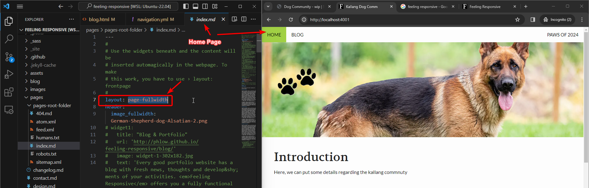
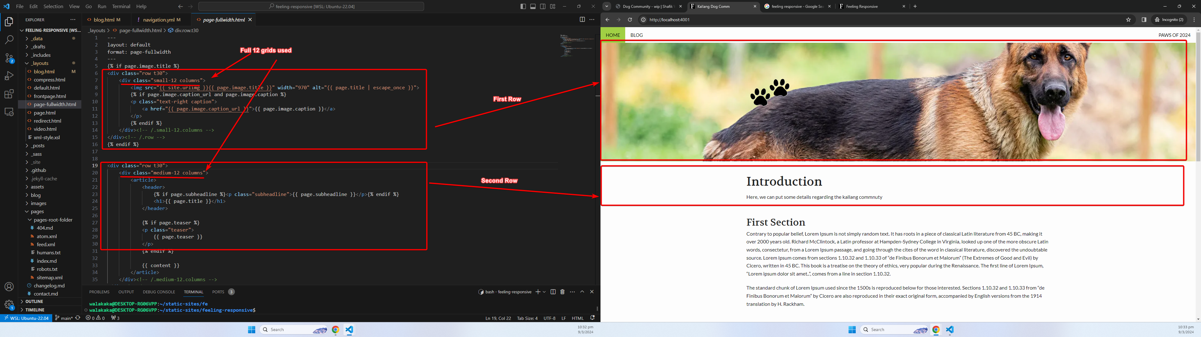
- The page fullwidth layout is made of two rows. Each row has a column utilizing the full 12 grids (hence utilizing the fullwidth). The content of the blog is inserted after the first two rows.
 For more details regarding the grid layouts used by
 Feeling Responsive, please check the Foundation Oficial Documentation - You can also see that the
page-fullwidthlayout uses thedefaultlayout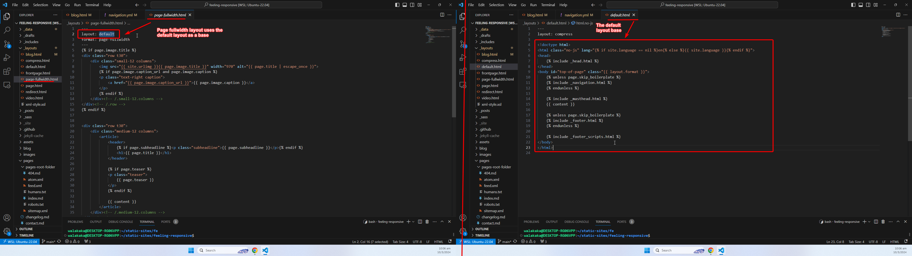
- The default layout is made up of blocks of snippets, that references templates from the
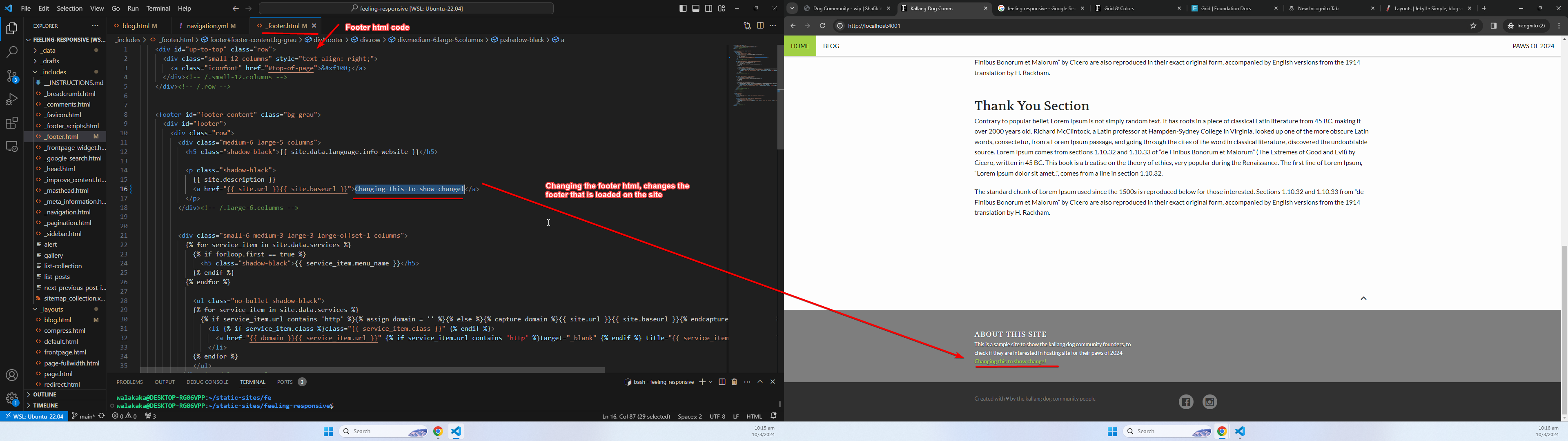
_includesfolder. For example, the_footer.htmlfile consists of the template that has the html code for the footer: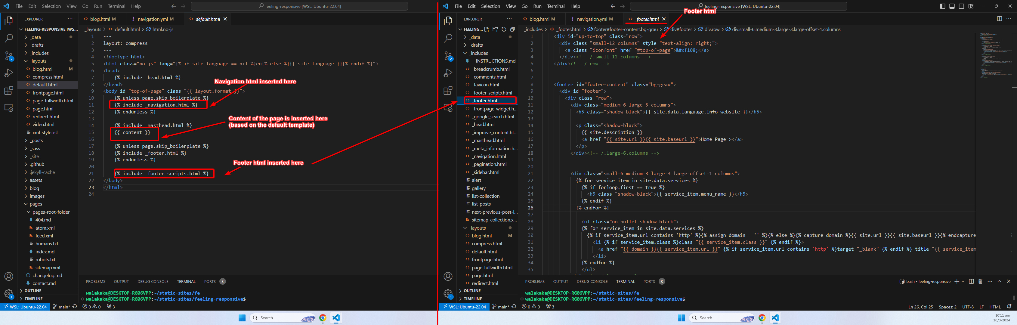 Note: The snippets are using the
 liquidsyntax. For more details regarding how layouts are rendered, please visit the Jekyll Official Documentation! - If we change the footer html, we can see that the changes are reflected in our site!
Images
Now we move on to images! The main images are stored in the images folder in the root directory. Once the images are placed in the images folder, they can be referenced by our blogs or pages: 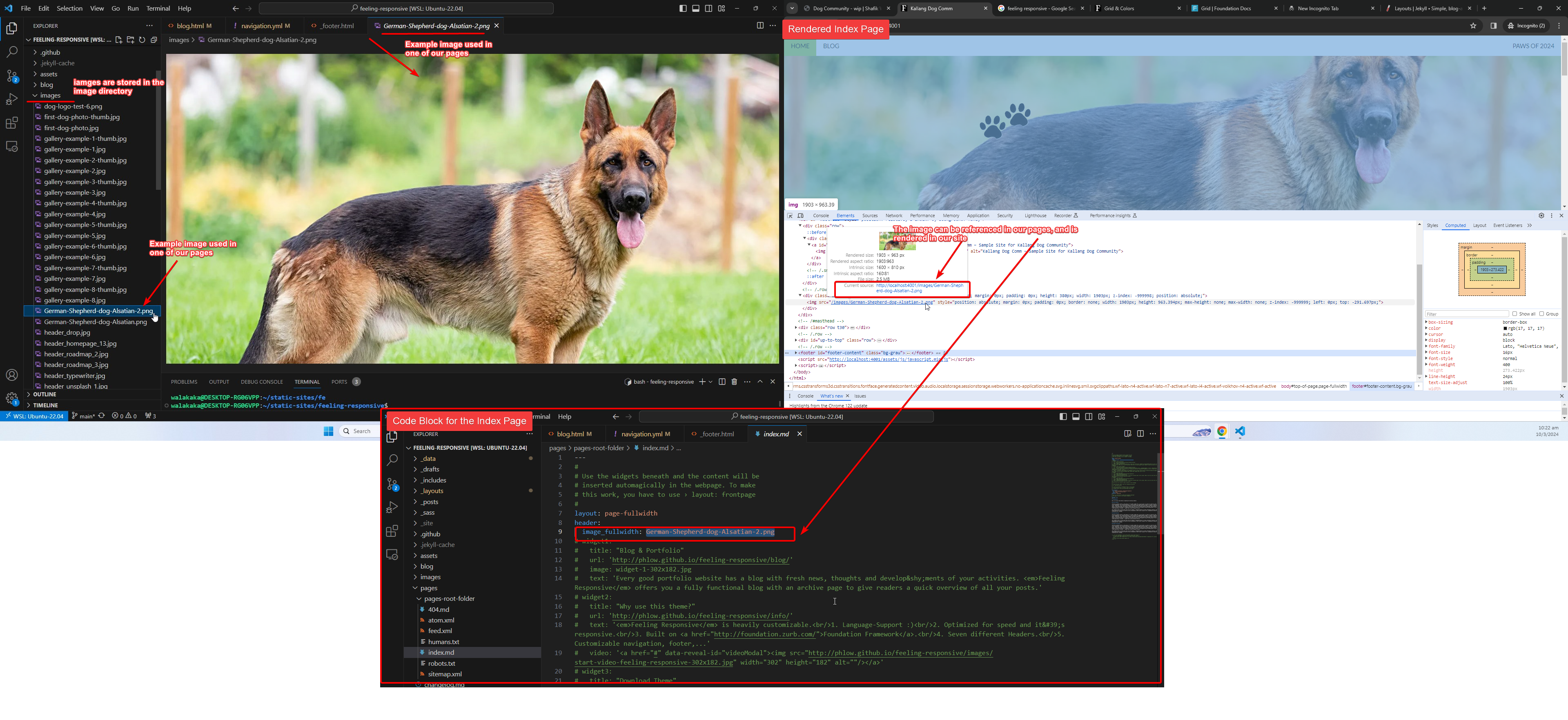
There are two main types of image:
- Feature/Header Image
- Thumbnail
Feature/Header image
Feature image will require an aspect ratio of 3:1. This is not a hard rule and the image would still render even if the aspect ratio is different. However, do note that the theme will vertically and horizontally center your image. If the focus of your image is not in the center, do note that you may have to trim your image accordingly 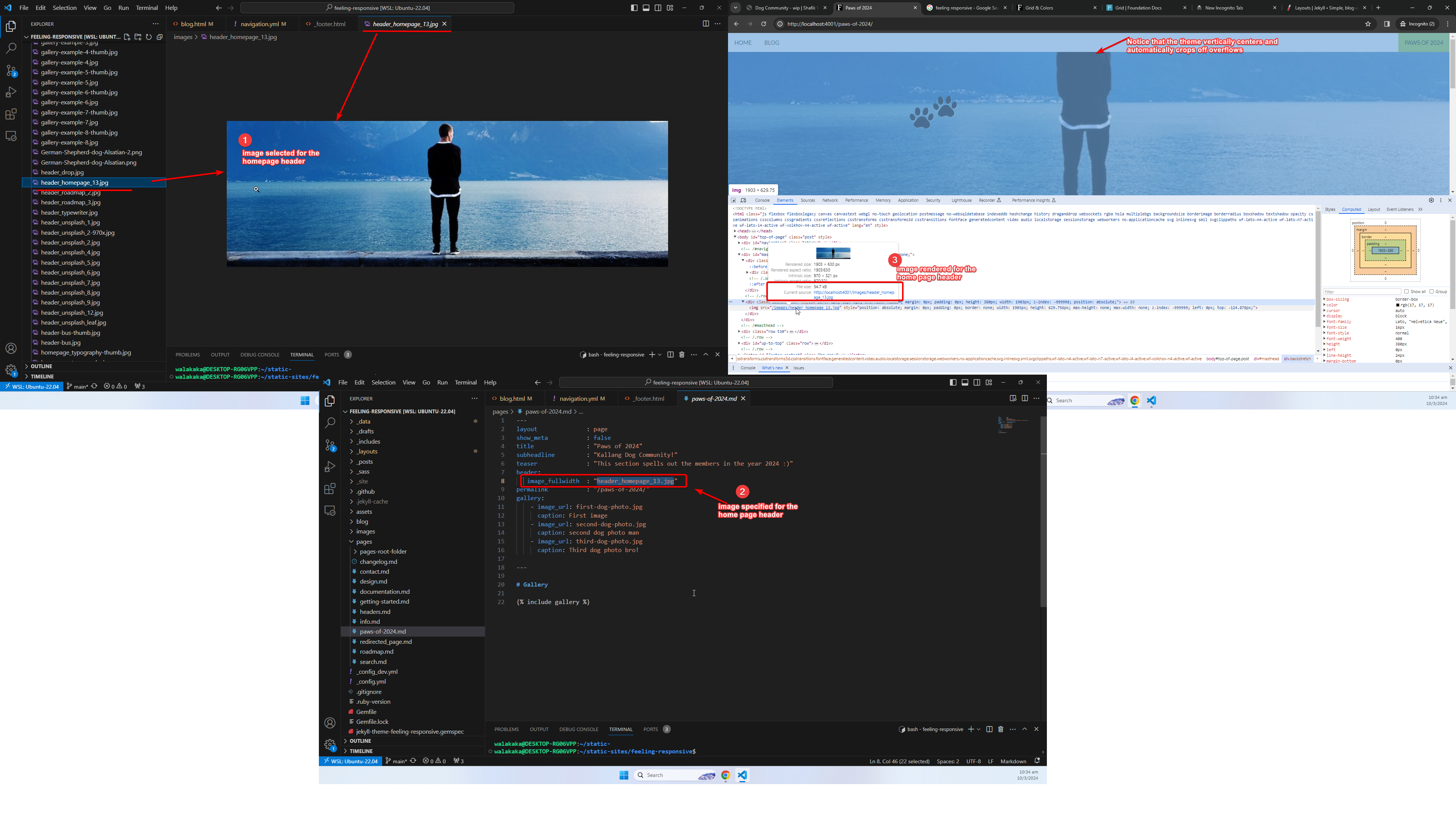
Thumbnail image
Thumbnail images will need an aspect ratio of 1:1. This will be used by galleries or blogpost lists – the thumbnail will be displayed alongside the summary of your blog post or the gallery. For thumbnail images, you must have suffix the filename with -thumb. 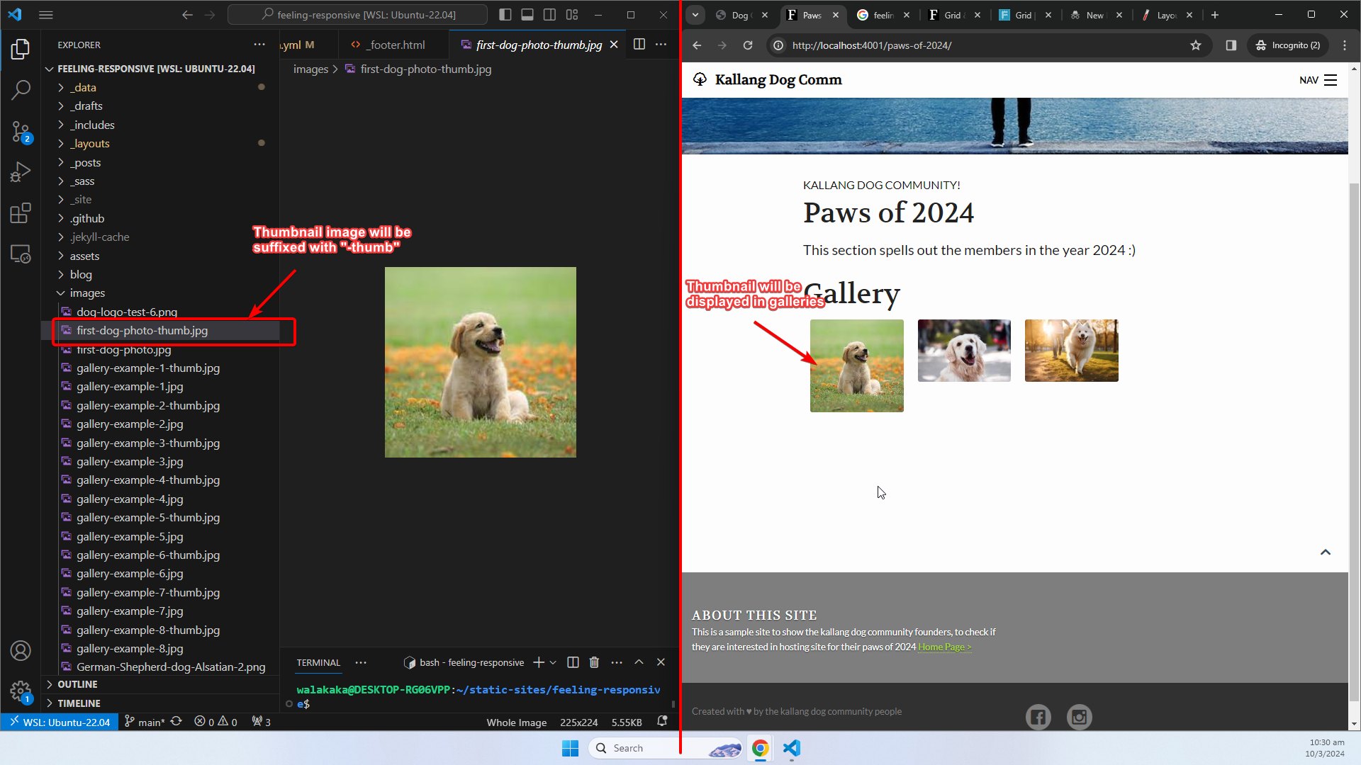
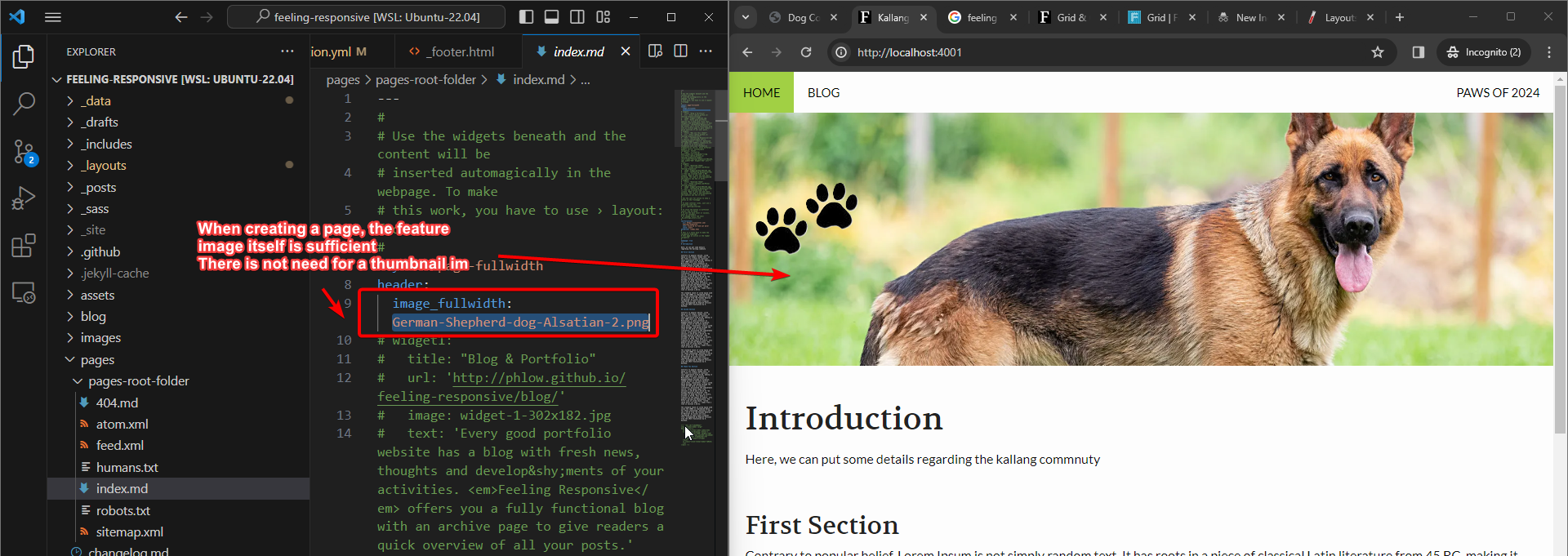
Additional Notes for Post articles
When creating a post article, a thumbnail image would be required as this would be used in the blog post listing. 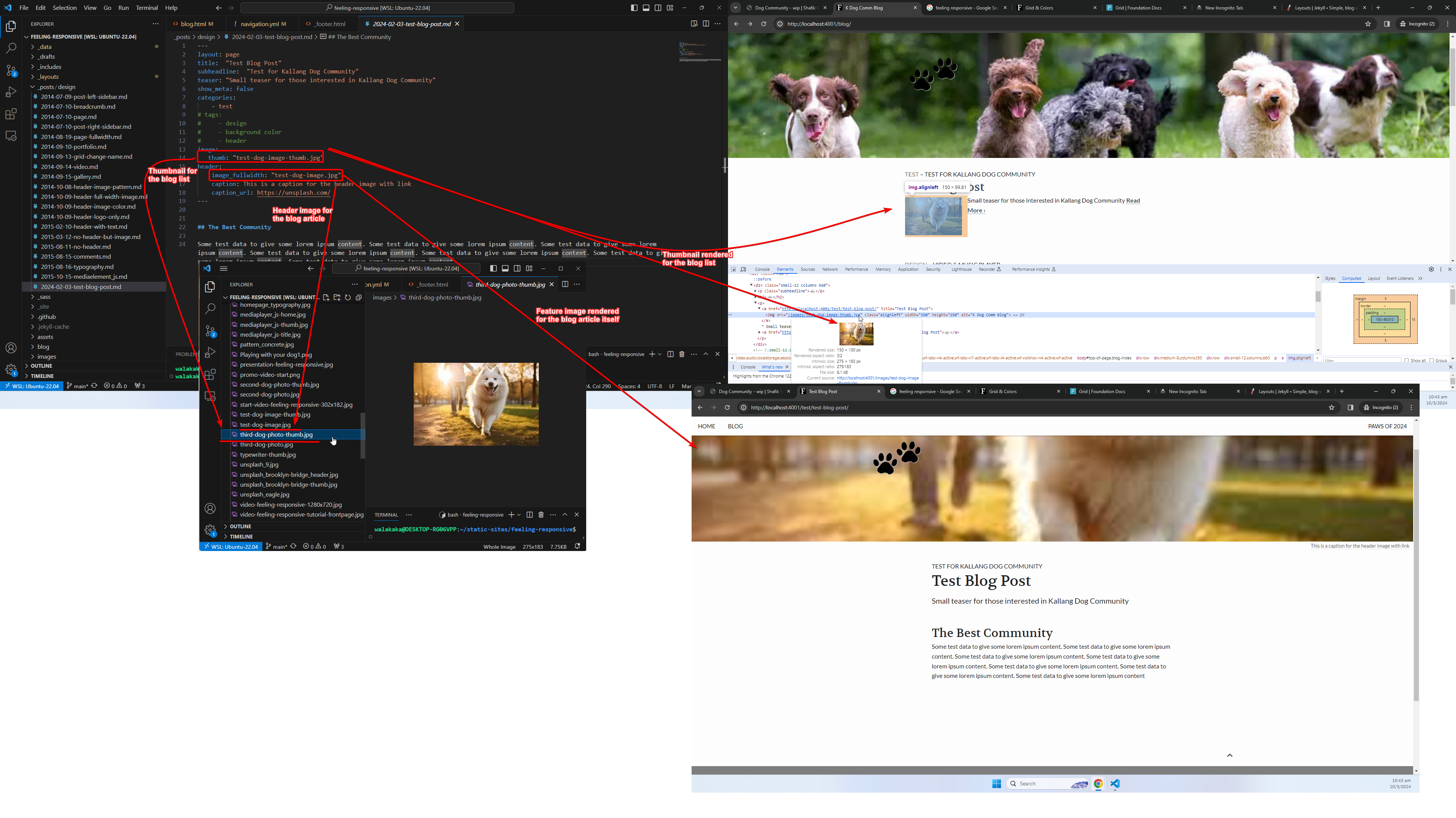
Additional Notes for Page articles
When creating a page article, the header image would suffice. We do not need to specify the thumbnail image as these pages do not appear in any listing that would display a thumbnail.
Gallery Feature
The Feeling Responsive template has a interesting gallery feature. Using this feature, you can provide a list of Feature Images and Thumbnail Images within the page in the Front Matter. You can subsequently, reference the gallery and display it anywhere within the page using this code block: {% include gallery %}
Let’s take a look at the sample Kallang Dog Community site gallery for example. This is created in the Paws of 2024 sample page:
- The gallery is specified in the
Front Matterusing thegalleryproperty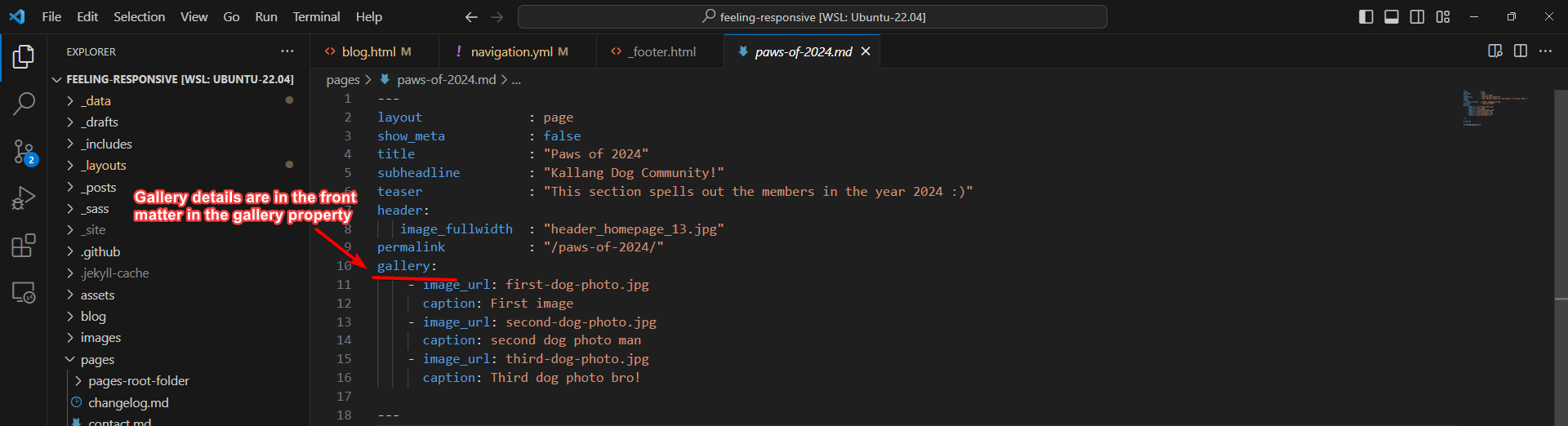
- Each object within the gallery property will have an
image_urland acaption. Theimage_urlwill be the filename of the feature image that you are planning to display in the gallery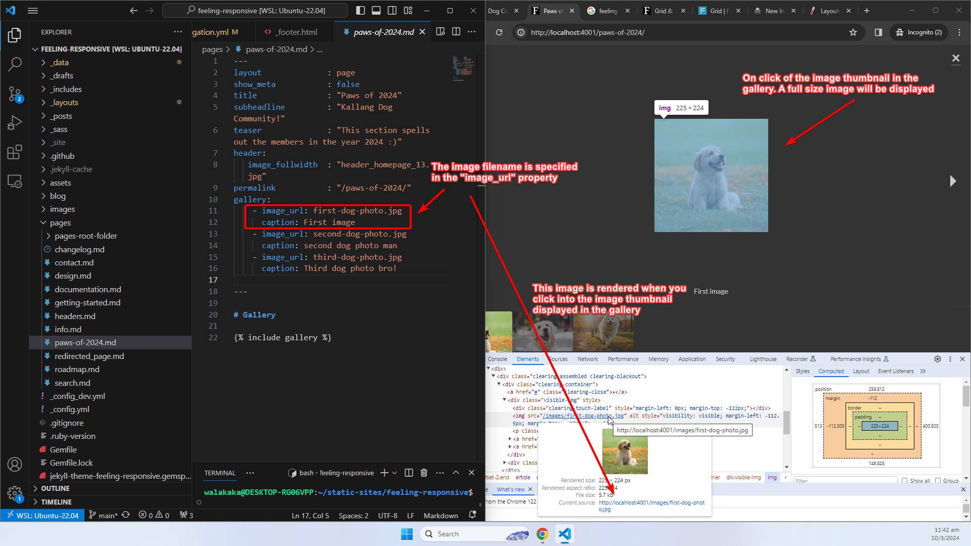
- The thumbnail of the image would have to be separately uploaded, in the
imagesfolder with a suffix-thumb. This file is automatically referenced by the template and<feature-filename>-thumbis automatically inferred to be the thumbnail for that particular image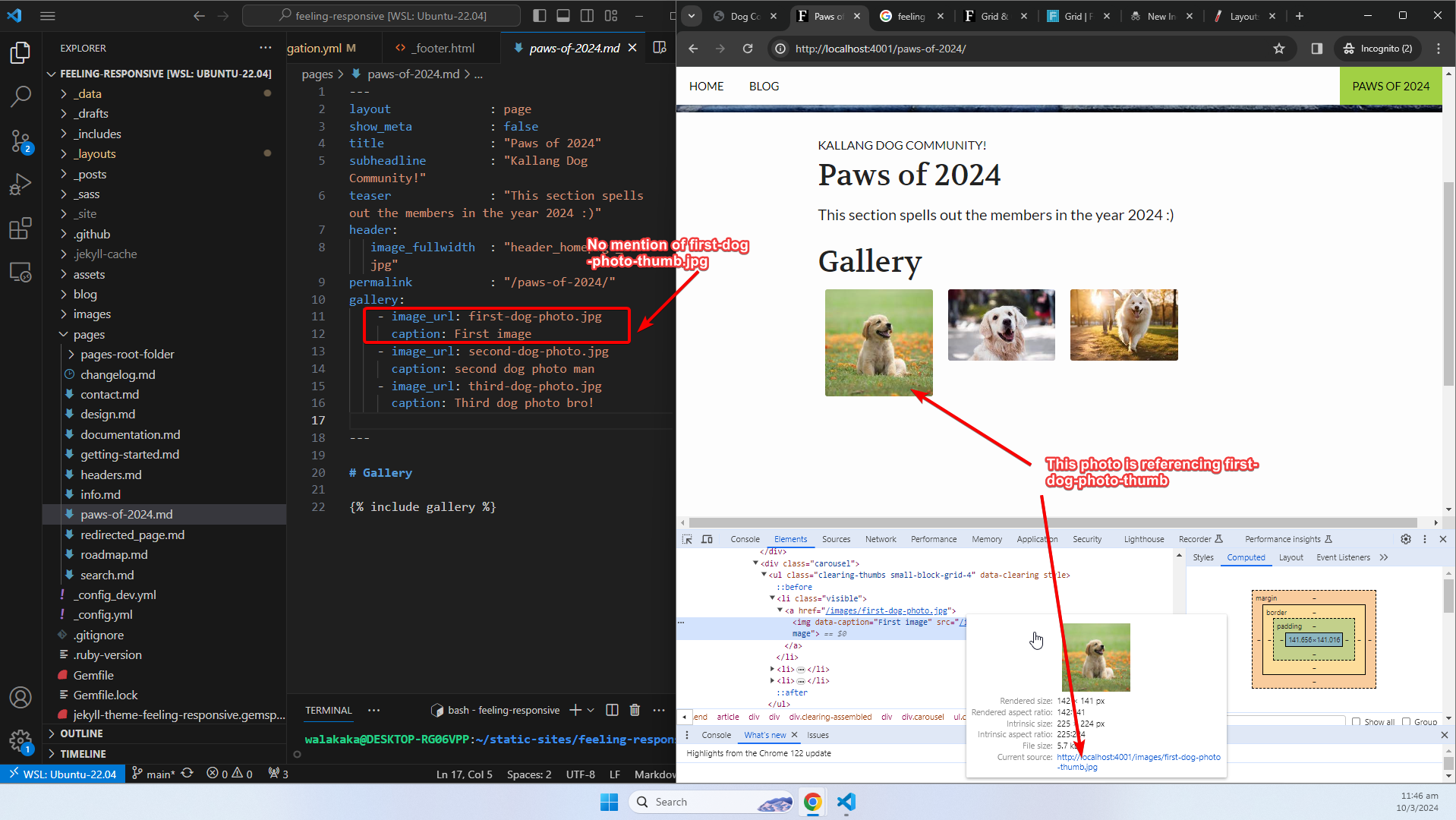
- Both
<feature-filename>and<feature-filename>-thumbmust have been uploaded into the images folder. These can be two separate images if required. For our example, these refers tofirst-dog-photo.jpgandfirst-dog-photo-thumb.jpg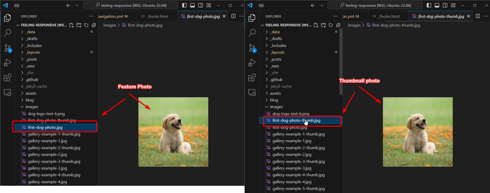
- Our gallery is referenced in the article using this liquid syntax:
{% include gallery %}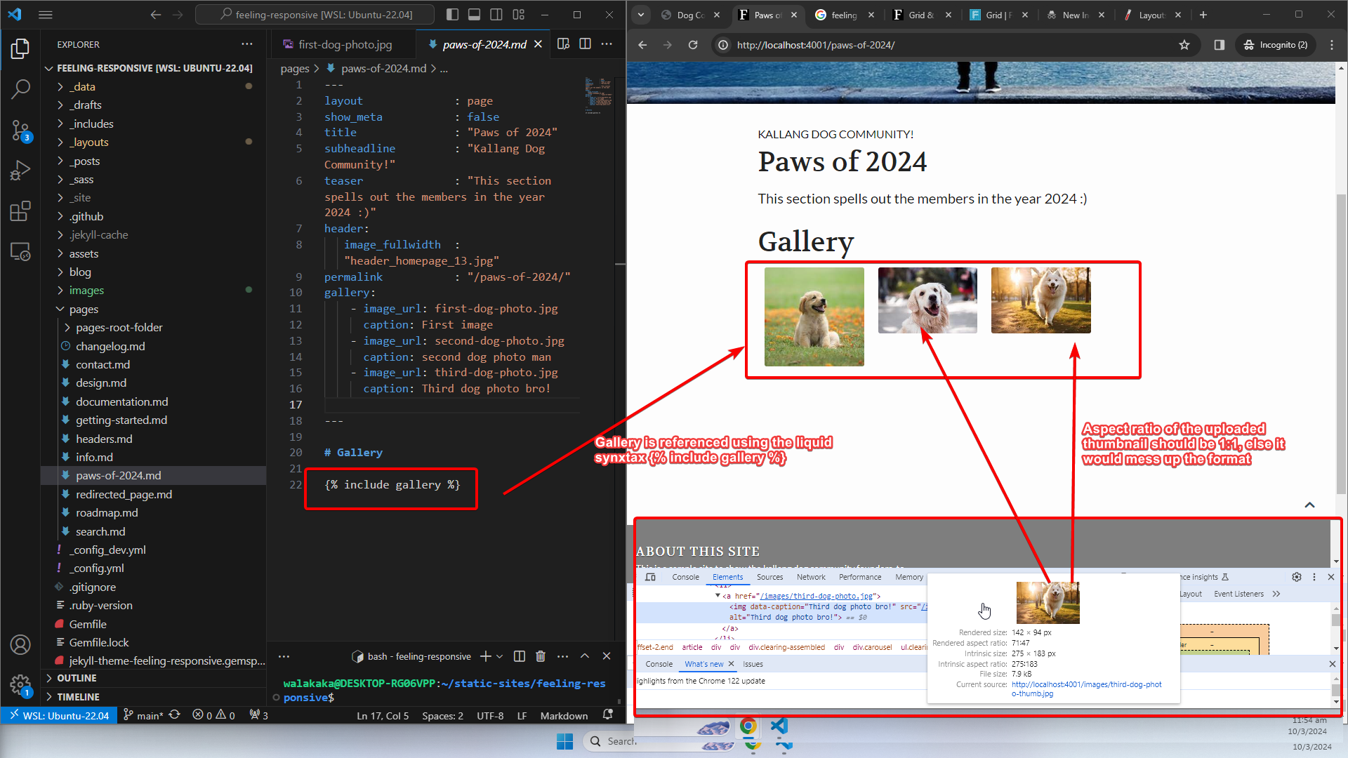 Note: The thumbnail sizes must be 1:1, else it would mess up the format of the gallery thumbnail templates!
Permalink
I cannot figure out how the permalink automatic generation works. Based on their config./yml, the permalink should be dependent on the categories and page title: 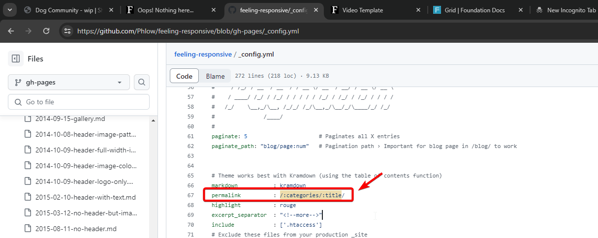
But there is a little discrepancy, or I’m misunderstanding the documentation. For example, the video page has a the category: design and title: video template. This should translate into a URL <baseurl>/design/video-template. However, the URL generated is <baseurl>/design/video: 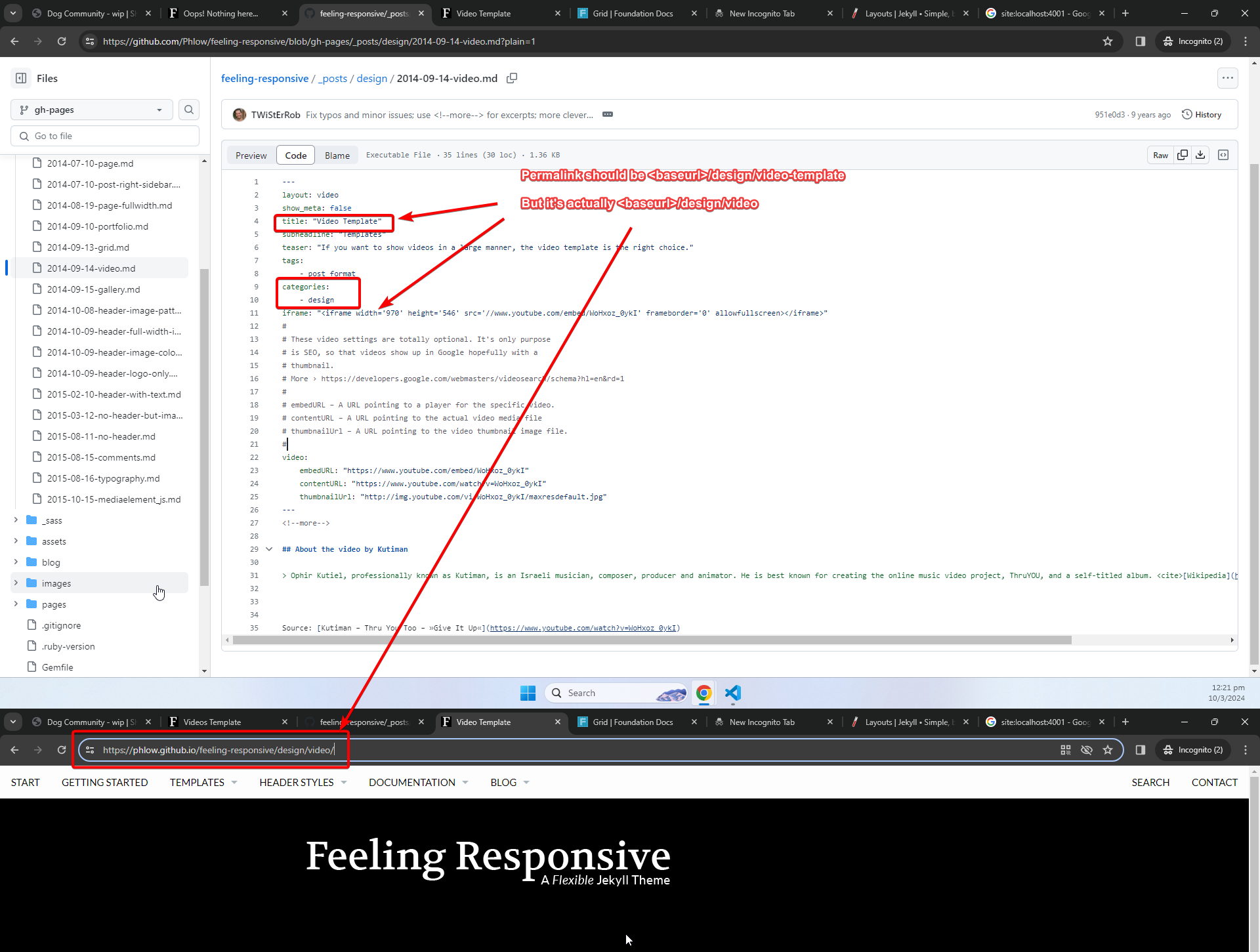
Meanwhile, there is a simple workaround for this – we’ll just hardcode the permalink as required. For example, Paws of 2024 can be accessed via <baseurl>/paws-of-2024: 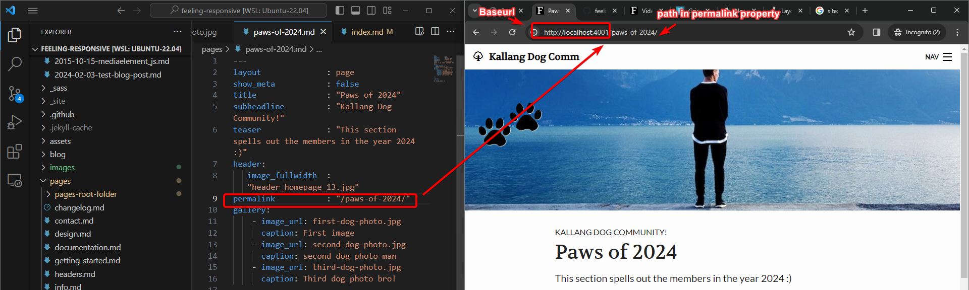
Colour Scheme
Lastly, we can also control the colour scheme in the _sass folder. We will reserve this for savvy designers. Since we are not, we are probably not going to make any changes to the colour scheme unless there is a specific request to do so. For savvy individuals however:
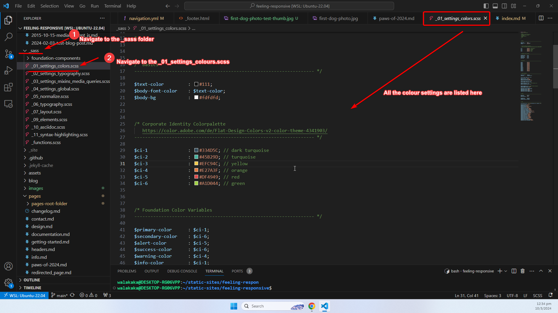
- Access the
_sassfolder - Navigate to the
_01_settings_colors.scss - All the colours settings are listed here, and you can amend them to your hearts content
Example of Editing the Colour Scheme
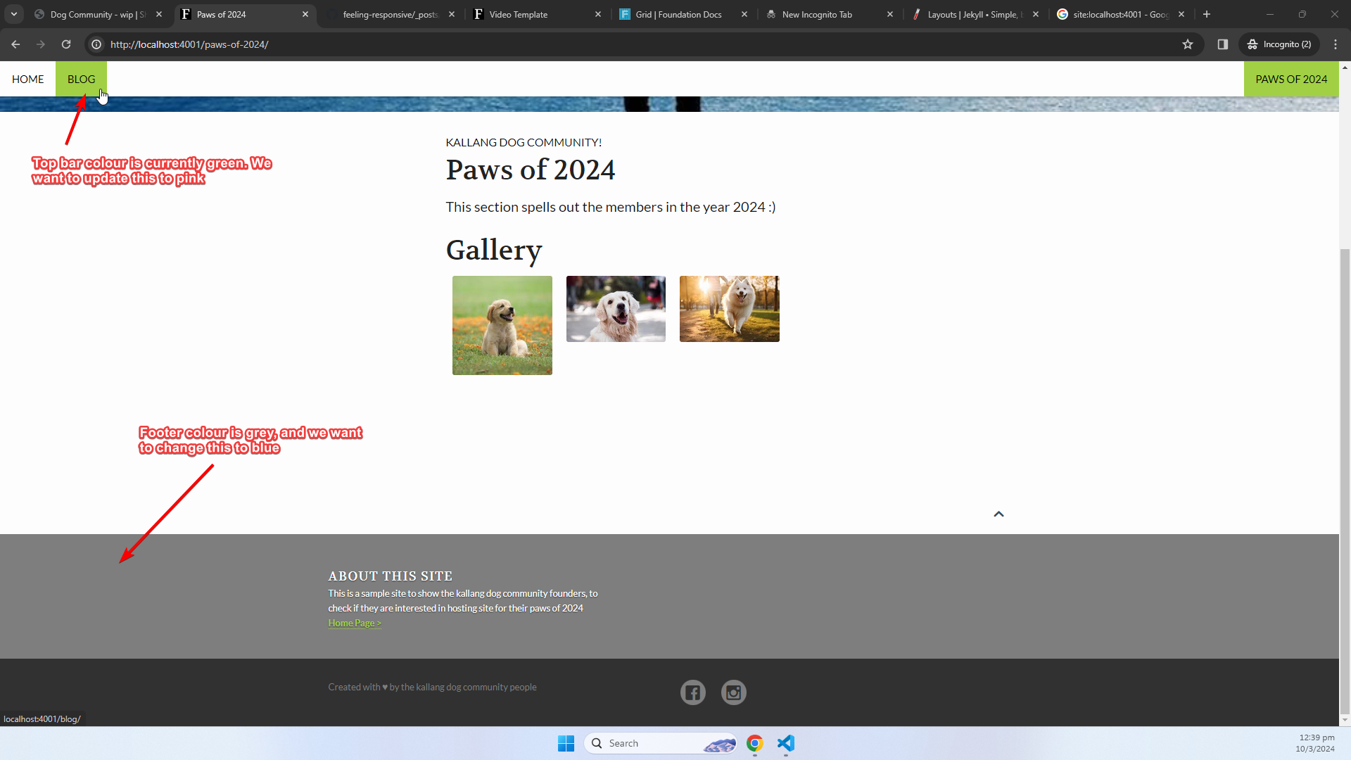
The colours settings allows for fine grain control for the color scheme that you want to implement. For example, suppose you want to do the following:
- Change the top bar colour when on hover to
Pink - Change the footer colour to
blue
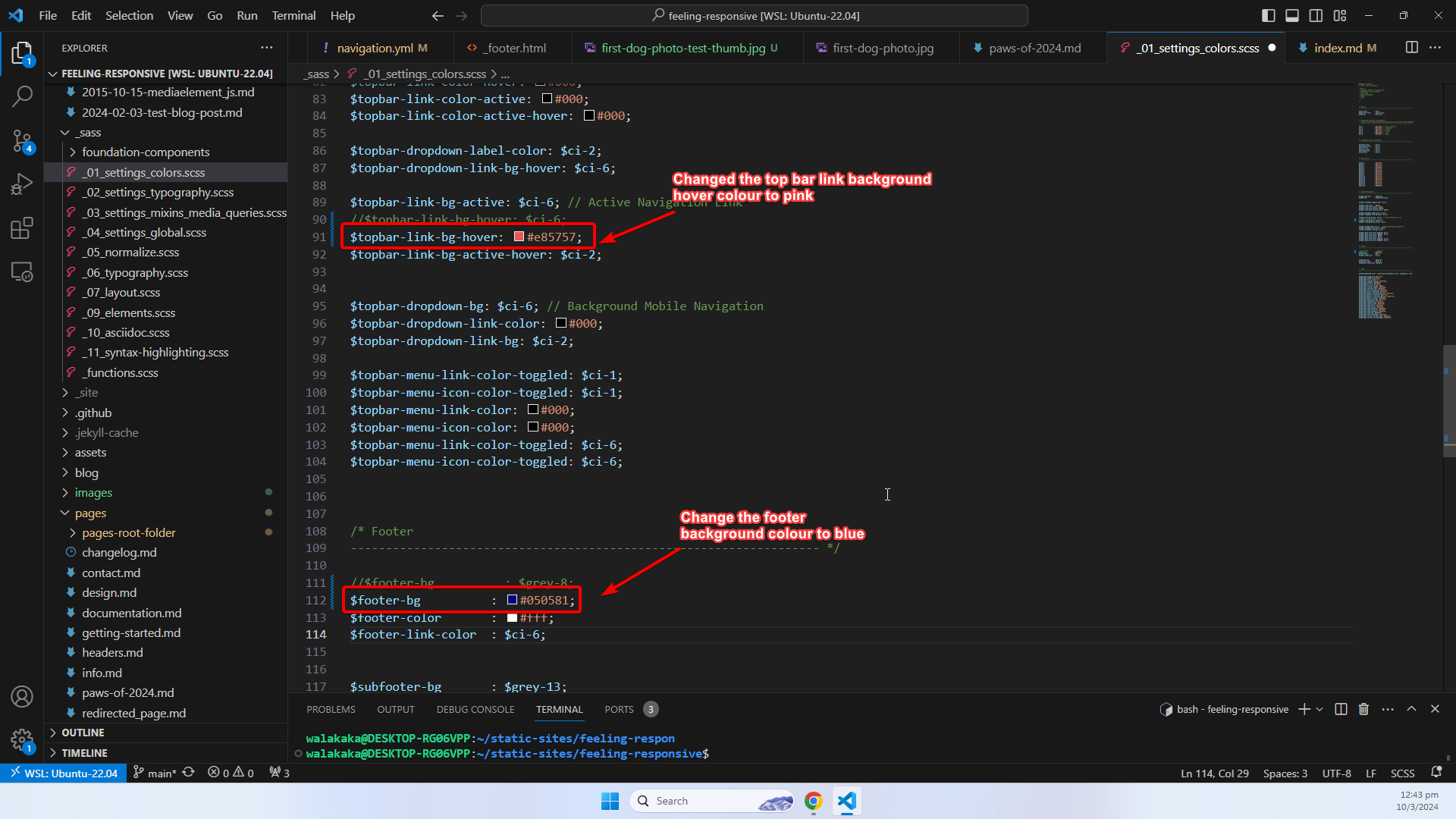
First, we need to figure out the property that controls the colour within the _01_settings_colors.scss file.
- The top bar on hover colour is controlled by the
topbar-link-bg-hoverproperty. - The footer background colour is controlled by the
footer-bgproperty. - We update the properties controlling the top bar background hover and footer colour to pink and blue respectively:
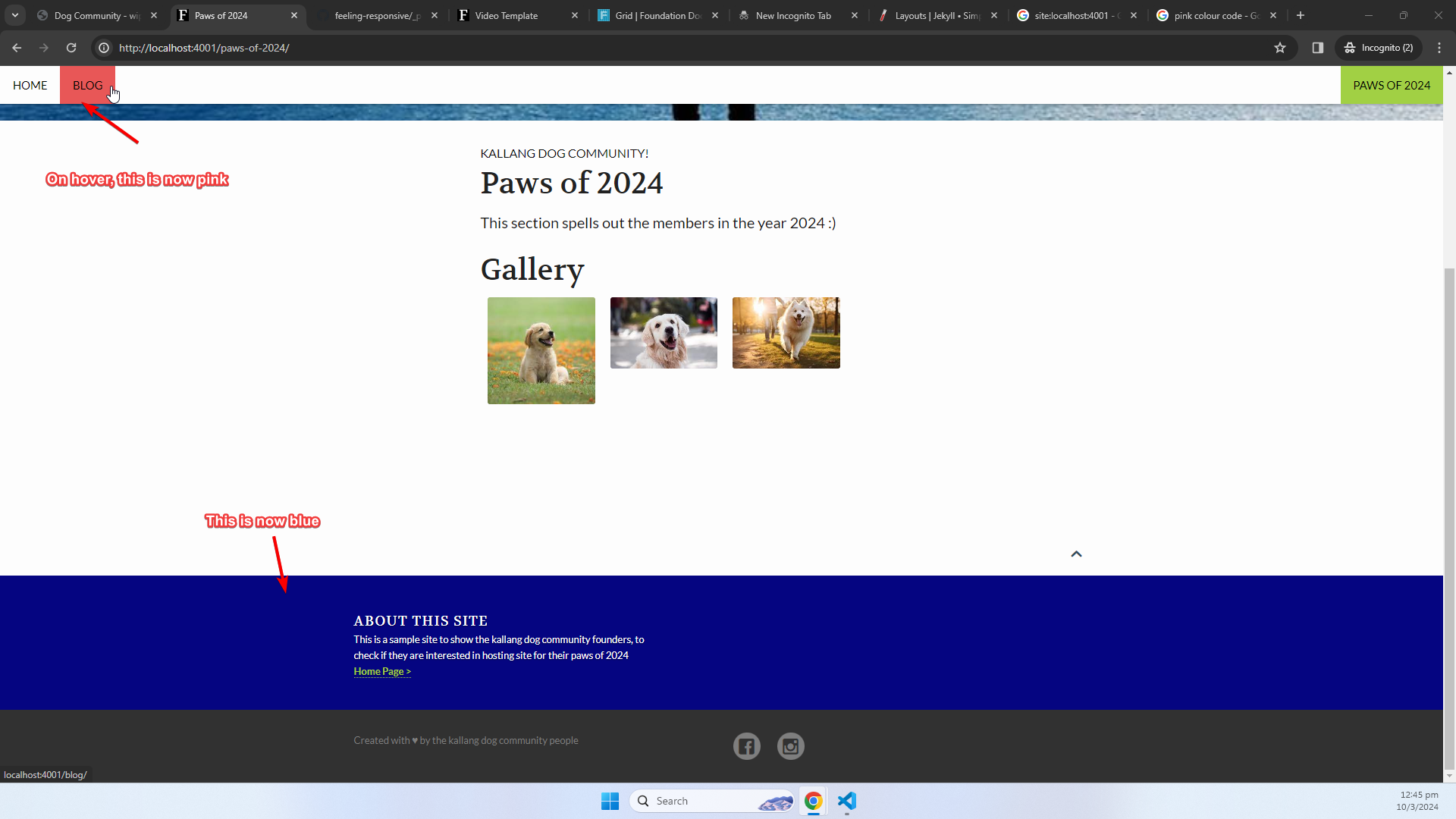
- The results is as follows:
Thank You
For those of you who took the time to reach the end, hope this helps. As always, writing this piece took longer than expected - and it forced me to obtain a clear understanding of what I’m writing about. For example – it was only during this article where I realized that I did not really understand how the automated permalink generation works. But nevermind that – got a workaround, and noted it down too.
Now, we’re all set and ready to Feel Responsive ;)!
Until then, peace and love
Shafik Walakaka