Checking Whether an Insurance “Investment” Ever Beats the Market — With Real Historical Prices
Table of contents
- The setup: three policies, one real question
- Why this is normally hard to check
- Building the actual model
- The finding: none of the three beat the market
- Decomposing why — three buckets, not two, and a different root cause for one policy
- The whole life policy’s opacity is a feature, not a bug
- What this took, and what happens next
- Images Required
A family member of mine has held a handful of older insurance-linked plans (ILPs) and a traditional whole life policy for years — the kind that bundle life/critical-illness protection together with an “investment” component that’s supposed to grow alongside it. The pitch, back when these were sold, was always some version of “you get protected and your money grows.” Nobody had ever actually gone back and checked whether the growing part was true.
So I did. Not with a rough guess or an insurer’s own illustration — with the actual real historical prices of the actual underlying funds, checked against what a plain world-index fund would have done with the exact same money, on the exact same dates.
Genericised throughout. The person involved isn’t named, and the dollar figures shown are representative, not the real numbers — swapped out to keep their finances private. The product names (they’re real, publicly named insurance products) and the methodology are exactly as they happened.
Updated 2026-08-30. An earlier version of this post computed one blended “fee/charge drag” number per ILP — mixing the actual cost of protection (the CI/TPD charges that fund the death/disability/critical-illness cover) together with the ILP’s separate, upfront distribution/admin charge. Those are two different things: the protection charge is a cost you’d pay under any strategy, including a plain term-life replacement, so it isn’t fair to hold it against “investment quality.” The distribution charge, on the other hand, only exists because of the ILP wrapper itself — a chunk of every premium never becomes investable capital in the first place because of it, and that should count against the ILP as an investment. This post now separates all three — protection cost, distribution/admin cost, and the amount actually invested — and reruns the market-index comparison strictly on the amount actually invested, on both sides. The table, chart, and “why is one worse than the other” section below all reflect the correction; the causal story for ILP #2 changed the most, since the old blended number was pointing at the wrong cause for it.
The setup: three policies, one real question
Three policies, two different mechanisms:
- Two Investment-Linked Policies (ILPs) from the same insurer — each one buys units in a handful of named sub-funds, and the death/disability/critical-illness protection is paid for by deducting monthly charges from those same units.
- One traditional participating whole life policy from a different insurer — premiums go into a pooled fund, and the insurer declares an annual “bonus” at its own discretion, rather than pricing individual units.
The question was simple to ask and, it turns out, genuinely hard to answer properly: for the money that went into the “investment” side of these three policies, would a plain, boring world-index ETF have done better?
Spoiler: yes, by a wide margin, on all three — and the reason was different for each policy, which is the more useful finding.
Why this is normally hard to check
An insurance account value isn’t quoted anywhere public. You get whatever number the insurer’s portal shows you today, and that’s it — no historical chart, no way to verify it independently.
The first real surprise: the underlying sub-funds inside the two ILPs are actually on Yahoo Finance. They’re fed through the same Morningstar data pipe as any other mutual fund, under slightly obscure tickers (0P00008T6M.SI-style identifiers) that don’t show up if you just search the fund’s plain-English name — you have to already suspect they exist. Once found, real historical monthly prices were sitting there, going back to late 2017, for free.
curl -s -A "Mozilla/5.0" \
  "https://query1.finance.yahoo.com/v8/finance/chart/0P00008T6M.SI?range=max&interval=1mo" \
  -o aia_regional.json
No API key, no auth — Yahoo’s chart endpoint is just a plain JSON GET. The hard part isn’t the fetch, it’s knowing the ticker exists at all.
The traditional whole life policy has no equivalent. It’s genuinely not unit-priced — more on that further down, because why it isn’t is more interesting than “the data wasn’t available.”
Building the actual model
The model had to respect how the money actually moved, not a simplified annual approximation:
- One policy pays monthly — modeled as 105 separate monthly unit purchases, each at that specific month’s real fund price, not a yearly lump sum.
- The other two pay annually, on their real anniversary dates — modeled exactly that way.
- Each contribution was split across the policy’s actual disclosed fund allocation (e.g. 40% into one regional-equity fund, 30% into another, 30% into a third), buying real units at the real price on that date, tracked forward to today.
The comparison side used VWRA (a globally diversified world-index ETF), not the S&P 500 — the S&P 500 is US-only and has had an unusually strong run this decade, which would make the comparison less honest. VWRA’s real price history only starts mid-2019, so for the stretch before that, a real global-market index return was used as a bridge, clearly logged as such rather than silently blended in. Every SGD contribution was converted to USD at that month’s real exchange rate before “buying” VWRA units, and converted back at today’s rate for the final number — currency risk isn’t a rounding error over a decade, so it got modeled properly instead of ignored.
flowchart LR
    A["Monthly/annual\npremium (SGD)"] --> B{"Convert to USD\nat that month's\nreal FX rate"}
    B --> C["Buy VWRA units\nat that month's\nreal price"]
    C --> D["Hold units forward\nto today"]
    D --> E{"Convert back to SGD\nat today's rate"}
Two real data problems, and how each was handled
A supposedly reliable public data feed had a silent 3-year gap. Finding this mattered more to the result than any of the modeling choices.
The first fund’s price history had a run of 0 values for two consecutive months — obviously a feed glitch, not a real 90%+ crash. That one was easy: skip zeros, fall back to the nearest real price.
The second problem was bigger: all five of the insurer’s fund tickers went completely silent for the same ~3-year stretch, both in monthly and daily granularity. Not a couple of missing points — a clean, identical gap across five otherwise-unrelated fund tickers. That pattern rules out coincidence; it’s a feed/vendor issue on the data provider’s side, not noise in any individual fund.
The fix: bridge the gap using the real global-index return as a proxy for those specific months, then reconnect to the real fund price the moment the feed resumes — and disclose which direction the bridge probably biases the result (in this case, generously toward the insurance product, since the region-specific funds being bridged actually underperformed global markets during exactly that stretch in reality). A model that hides its own data gaps is worse than one that shows its seams.
The finding: none of the three beat the market
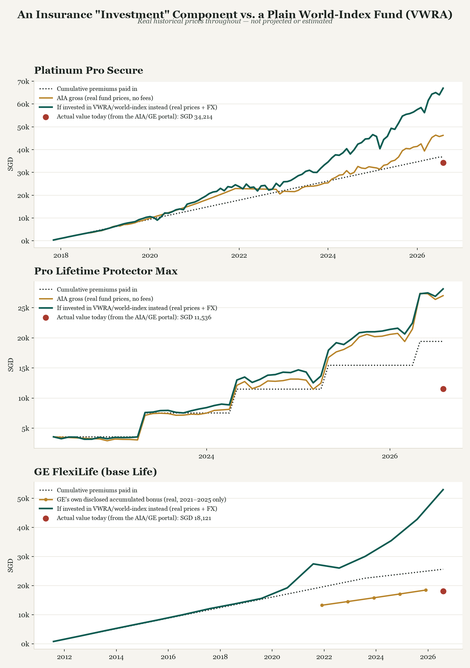
Representative, but real-methodology, historical numbers — each policy compared over its own actual lifespan (roughly 9, 4, and 15 years respectively, since that’s how long each has actually existed):
| Policy | Premiums paid in | Of which invested | Actual value today | Same invested amount, in VWRA instead |
|---|---|---|---|---|
| ILP #1 (~9 years) | ~SGD 40,000 | ~SGD 32,700 (82%) | ~SGD 34,700 | ~SGD 59,600 |
| ILP #2 (~4 years) | ~SGD 21,000 | ~SGD 11,800 (56%) | ~SGD 12,300 | ~SGD 17,100 |
| Whole life (~15 years) | ~SGD 25,700 | n/a — no disclosed split, see below | ~SGD 19,000 | ~SGD 52,900 (full premium — the only basis available) |
Two things worth sitting with. First: the actual account value today is below total premiums paid in, for both ILPs — after 9 years and after 4 years respectively. Not “grew slower than the market” — actually underwater, in absolute terms, despite nearly a decade of real market growth happening around it. Second, and this is the correction: less than the full premium ever became investable capital in the first place — 82% for ILP #1, only 56% for ILP #2. The rest was a distribution/admin charge, deducted before any unit was ever bought. Comparing “money in VWRA instead” against the full premium, like the original version of this post did, overstates how much capital the ILP was actually working with — so the VWRA column above is now the same invested amount on both sides, not the full premium.
Decomposing why — three buckets, not two, and a different root cause for one policy
The old version of this post split the gap into “fee drag” and “fund-selection drag.” That blended two genuinely different things into one number. The corrected version separates three:
- Cost of protection — the CI/TPD charges that actually fund the death/disability/critical-illness cover. A cost you’d pay under any strategy; not a fair charge against “investment quality.”
- Amount actually invested — the portion of premium that became fund units in the first place.
- Distribution/admin cost — the upfront charge that exists only because of the ILP wrapper, deducted before any unit is bought. This is the one that should count against the ILP as an investment vehicle.
| ILP #1 | ILP #2 | |
|---|---|---|
| Cost of protection (drag from real invested growth → actual value) | ~16% of gross growth | ~25% of gross growth |
| Distribution/admin cost (never became investable capital) | ~18% of premium | ~44% of premium |
| Fund-selection drag (real invested growth vs. VWRA, same invested capital) | ~31% of VWRA-equivalent — the dominant factor | ~4% of VWRA-equivalent — a small factor |
These are two different products failing for two different reasons — and correcting the blended number actually sharpens that story rather than changing it. ILP #1’s dominant problem is still fund selection — a heavily region-concentrated fund mix that genuinely lagged a global index over this exact stretch, independent of any charge. ILP #2’s dominant problem turns out to be protection cost, not fund selection and not admin cost — its own underlying funds actually tracked the world index closely once the comparison is run on an equal invested-capital basis (only a ~4% gap). What’s actually crushing this policy’s real-world outcome is the CI/TPD charges funding its protection, which are large relative to how little of its premium ever became investable capital to begin with. Its distribution cost is also the highest of the two as a share of premium — but that’s a separate problem from protection cost, not the same one restated.
The whole life policy’s opacity is a feature, not a bug
The traditional whole life policy couldn’t get the same fund-price treatment, and the reason is worth spelling out rather than treating as a data-availability shrug:
| ILP (unit-linked) | Traditional whole life (participating) | |
|---|---|---|
| Where premiums go | Named, individually-priced sub-funds | One pooled fund, mixed across every policyholder |
| What generates growth | The real market price of the chosen fund | Investment surplus, allocated at the insurer’s discretion as an annual “bonus” |
| Verifiable day to day? | Yes — same as checking any stock/fund price | No — an annual bonus rate, nothing traceable further |
| Smoothing | None — real-time market exposure | Deliberate — the insurer holds bonus rates steady across good and bad years on purpose |
Confirmed directly, not assumed
The whole life policy’s own bonus statements show its declared rate held perfectly flat through a year the underlying participating fund actually returned −7.6%. That’s not an oversight — smoothing bad years is the literal product design, meant to protect policyholders from short-term volatility. It just also means “transparent, independently-verifiable pricing” and “this product category” are close to mutually exclusive, by design, everywhere this product type is sold — not a flaw specific to this one insurer.
The opacity has a real, concrete consequence for this post’s own methodology: there’s no way to run the same “cost of protection vs. distribution cost vs. invested amount” split on the whole life policy that the two ILPs above got. A handful of real, disclosed annual bonus figures does exist for a short recent stretch, though — enough for one narrow, honest experiment. Take that real disclosed bonus as a starting balance, and ask: over that same short window, using real market prices, would VWRA have grown it faster? Over the specific few years on file, the smoothed bonus rate and the VWRA-equivalent came out within a percentage point of each other — smoothing had genuinely buffered one bad market year enough to roughly keep pace, in that narrow stretch. That’s a real result, not a rounding artifact — but it’s also not evidence the product beats the market: the disclosed bonus rate itself sits below the long-run historical average for global equities, and a single short window that happens to straddle one bad year for the index is exactly the kind of sample where smoothing looks its best. It doesn’t change the 15-year conclusion above; it’s a small, honest data point about why smoothing can look competitive over a short enough window, even when it isn’t over the long run.
What this took, and what happens next
Building this — fetching five obscure fund tickers, discovering and bridging a real 3-year data gap, simulating monthly and annual unit purchases with proper FX handling, and decomposing the result into fees vs. fund selection — took an AI agent about an hour, once the approach was worked out. A financial analyst doing the equivalent by hand — assuming they even knew to check whether these fund prices were public at all — would realistically be looking at a full day’s work or more, and that’s before writing it up.
That’s the subject of the next post — including the harder question this one doesn’t answer on its own: given the “loss” already sitting there today, does it actually make sense to lock it in, or was a recovery about to happen anyway? That needs a forward-looking projection, not just a historical one, and it produced one result that genuinely wasn’t a landslide either way — which turned out to be the most interesting part of the whole exercise.
Images Required
None — the chart in this post is generated from the same real market-price data and methodology as the analysis, run on the representative contribution amounts described above (regenerated 2026-08-30 alongside this correction), not a placeholder.
Until next time, peace and love!